
A colleague shared this and I’ll just leave it here in case I need it later.
 (Quick web search did not turn up a source, but if this is yours and you want it removed or attributed, drop me a line.)
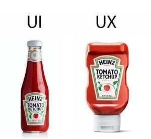
I know this image is controversial (see e.g. Chris Compston on Medium “My response to the ketchup bottle UX vs UI meme”). It is wrong on many levels. As a metaphor, it is slightly off (“UI is a glass ketchup bottle in a vintage design”?). As an analogy, it does not make sense (“UI is to glass ketchup bottle as UX is to a squeeze bottle”?). It ignores that fact that the glass bottle, too, has a UX dimension und that the squeeze bottle may offer an arguably better UX only because it also has a UI.
BUT because of (not despite) such weaknesses, this image is a great thought starter if you want to discuss why you need to consider UX from the start of your next product development project and why simply bringing in a (UI) designer will not cut it.
[Dieser Beitrag erschien zuerst auf meinem inzwischen geschlossenen Blog „KonzeptioNerd“]